10,000 search results
(0.036 seconds)
- Hybi4 Script Neo by Hybi-Types,
$3.99 This typically handwritten script fonts are based on my own handwriting. First release of the Hybi4-Script was back in 1999. Now it’s renewed and completed with many more special characters and a bold style.
 - ITC Garamond Handtooled by ITC,
$34.99Claude Garamond (ca. 1480-1561) cut types for the Parisian scholar-printer Robert Estienne in the first part of the sixteenth century, basing his romans on the types cut by Francesco Griffo for Venetian printer Aldus Manutius in 1495. Garamond refined his romans in later versions, adding his own concepts as he developed his skills as a punchcutter. After his death in 1561, the Garamond punches made their way to the printing office of Christoph Plantin in Antwerp, where they were used by Plantin for many decades, and still exist in the Plantin-Moretus museum. Other Garamond punches went to the Frankfurt foundry of Egenolff-Berner, who issued a specimen in 1592 that became an important source of information about the Garamond types for later scholars and designers. In 1621, sixty years after Garamond's death, the French printer Jean Jannon (1580-1635) issued a specimen of typefaces that had some characteristics similar to the Garamond designs, though his letters were more asymmetrical and irregular in slope and axis. Jannon's types disappeared from use for about two hundred years, but were re-discovered in the French national printing office in 1825, when they were wrongly attributed to Claude Garamond. Their true origin was not to be revealed until the 1927 research of Beatrice Warde. In the early 1900s, Jannon's types were used to print a history of printing in France, which brought new attention to French typography and the Garamond" types. This sparked the beginning of modern revivals; some based on the mistaken model from Jannon's types, and others on the original Garamond types. Italics for Garamond fonts have sometimes been based on those cut by Robert Granjon (1513-1589), who worked for Plantin and whose types are also on the Egenolff-Berner specimen. Linotype has several versions of the Garamond typefaces. Though they vary in design and model of origin, they are all considered to be distinctive representations of French Renaissance style; easily recognizable by their elegance and readability. ITC Garamond? was designed in 1977 by Tony Stan. Loosely based on the forms of the original sixteenth-century Garamond, this version has a taller x-height and tighter letterspacing. These modern characteristics make it very suitable for advertising or packaging, and it also works well for manuals and handbooks. Legible and versatile, ITC Garamond? has eight regular weights from light to ultra, plus eight condensed weights. Ed Benguiat designed the four stylish handtooled weights in 1992." In 1993 Ed Benguiat has designed Handtooled versions. - Ebisu by Thinkdust,
$10.00 Ebisu is a sans serif family consisting of 10 different weights. Designed by Alex Haigh in 2010, and influenced by one of his original designs from 2008 Hiruko - Ebisu loses the soft sans serif curves, for a more robust geometric styling. But it’s much more than a geo-replica. The lowercase characters also have a more exaggerated sharpness that gives the whole family a unique look and feel. The kerning has been individually crafted for each letter, with vigorous attention - to ensure that each letter from is produced in a way that works with every member of the set, for a tightly knit sans serif family. It speaks many languages too. The open type features have an extended character set to support Eastern and Western European languages. With each weight conveying a different personality, Ebisu is set to become the modern new sans serif family to sit alongside you classics for versatility, cleanliness and a crafted edge.
 - Stevens Titling by Linotype,
$29.99 Stevens Titling refers to the classic Roman alphabet as it appears on the Trajan column and numerous other monuments. With its realistic brush strokes, it shows the letterforms as they might have been sketched on the marble before the stonecutter reached for his hammer and chisel. The four fonts that constitute the Stevens Titling suite are named after animals — badger, boar, sable and wolf –, each known for the specific character of its hairs when used to make painting brushes. Sable Brush is the most formal and elegant, with solid forms which show no obvious trace of the handdrawn brush stroke; it comes with a set of small capitals for those classical titles preferred by Hollywood. In fact, each of these fonts would do a great job as a film title and poster font. The Badger Brush variant is compact and firm; Boar Brush is dramatic, and in Wolf Brush each part of the letter is made up of realistic, dry strokes.
 - Stabile by PintassilgoPrints,
$26.00 Stabile is a rather stylish casual font with loads of good vibes and alternates: there are four glyphs for each letter, two for each numeral plus swashes to this side and the other. Two for each side, in fact. It's a flexible font that looks unique and quite distinctive, with its charming uneven look that gets even more uneven when Contextual Alternates are turned on. Stabile family brings a delish accompanying font, Stabile Toys, packed with organic shapes inspired by the breathtaking work of the american artist Alexander Calder. These play together deliciously well, you can bet. Are you prepared to balance them? Enough reading, then, just go ahead! A couple quick notes on usage: . Go with Contextual Alternates to instantly cycle glyphs. Eye-catching results guaranteed! . Swash feature turns on (guess what...) swashes. But there's always alternative swashes, like to this side going up or to this side going down, that side up or down, so it's cool to pick your choices through a glyphs palette.
 - Molex Shoora by Jolicia Type,
$15.00 Molex Shoora is a typeface that is inspired by retro-style writing. We make each element with a unique style, made on the top and bottom edges thick and in the middle it starts to thin which is consistent with each letter There are 14 font family for the choice of the desired letter design 31 ligatures combined with each other add to the fun style 410 total glyphs Support 88 languages: Afrikaans Albanian Asu Basque Bemba Bena Breton Catalan Chiga Colognian Cornish Croatian Czech DanishDutch Embu English Esperanto Estonian Faroese Filipino Finnish French Friulian Galician German GusiiHungarian Indonesian Irish Italian Kabuverdianu Kalaallisut Kalenjin Kamba Kikuyu Kinyarwanda LatvianLithuanian Lower Sorbian Luo Luxembourgish Luyia Machame Makhuwa-Meetto Makonde Malagasy MalteseManx Meru Morisyen North Ndebele Norwegian Bokmål Norwegian Nynorsk Nyankole Oromo Polish PortugueseQuechua Romanian Romansh Rombo Rundi Rwa Samburu Sango Sangu Scottish Gaelic Sena Serbian ShambalaShona Slovak Soga Somali Spanish Swahili Swedish Swiss German Taita Teso Turkish Upper Sorbian Uzbek (Latin) Volapük Vunjo Walser Zulu
 - Pierrot by Linotype,
$29.00Günter Jäntsch designed Pierrot in 1973. Its irregular flowing letterforms express the design from this time, where many personal irregular designs had been made. Pierrot is suitable for invitation cards, posters and signage. - Aspire Narrow SmallCaps by Grype,
$18.00 While the Aspire SmallCaps family finds its roots of inspiration in the ACURA automotive company logo, with its wider base, the Aspire Narrow SmallCaps family condenses those styles into something more suitable for larger bodies of text in a more standardized width. Aspire Narrow SmallCaps is perhaps the most true to form tribute to the original all capitals inspiration logotype. It maintains all capital forms (whether standard or smallcaps) and yet is still strikingly powerful in its presence and readability including numerals, and a comprehensive range of weights, creating a straightforward, uncompromising collection of typefaces that lend a solid foundation and a broad range of expression for designers. Here's what's included with the Aspire Narrow SmallCaps Family bundle: - 430 glyphs per style - including Capitals, Small Caps, Numerals, Punctuation and an extensive character set that covers multilingual support of latin based languages. (see the 6th graphic for a preview of the characters included) - Stylistic Alternates - alternate characters that remove the angled stencil cuts for a more standardized text look. - 3 weights in the family: Light, Regular, & Black. - 3 obliques in the family, one for each weight: Light, Regular, & Black. - Fonts are provided in TTF & OTF formats. The TTF format is the standard go to for most users, although the OTF and TTF function exactly the same. Here's why the Aspire Narrow SmallCaps Family is for you: - You're in need of automotive sans font family with a range of weights and obliques - You're love that ACURA letter styling, and want to design anything within that genre - You're looking for an alternative to Eurostile with more stylized letterforms. - You're looking for a battle-tech typeface for your futuristic war chest labelling. - You just like to collect quality fonts to add to your design arsenal
 - Guaruja Neue by Tipogra Fio,
$- Get in touch with Tipogra Fio and get inspired by Guaruja Neue specimens. Guaruja Neue is a neo-grotesque typeface with additional industrial traits to it, such as open corners in diagonal glyphs and short curves. The semi-cursive italics shapes, more than an orthographic matter, give sea waves for the headlines and copies that Guaruja Neue will compose, since it is named after a city on the coast of São Paulo, Brazil. Stylistic alternates, ligatures, ordinals, arrows and emojis give extra personality for texts that cross millennial and modernist concepts, going from a comprehensive Latin script, including Vietnamese support, until a basic Cyrillic set. Brazilian music tells the graphic story of Guaruja Neue specimens, songs that speak about beaches and the city of Guarujá, as well as the inspiration of 50’s and 60’s modernist design and the music movement of Bossa Nova. This family is also an evolution of Guaruja Grotesk (2021), a typeface with four fonts —Regular, Italic, Bold and Bold Italic— developed as part of a design school project, that now in Neue gains professionalism, refinement and knowledge. Guaruja Grotesk took 18 months to make, and Neue took additional 12 months of redrawing and rethinking, as design as processes. Part of the project got feedback from the typeface designer Ulrike Raush, under the Alphabettes mentorship program. Overview and features: 8 weights and 8 italics; 2 free fonts: Guaruja Neue Regular and Guaruja Neue Italic; Extended Latin and basic Cyrillic; 800+ glyphs; Numbers: proportional, tabular, superscripts, subscripts, denominators, numerators and fractions; Greek for math; Case-Sensitive forms; Arrows; Standard and discretionary ligatures; SS01: one story a and SS02: two story g; Emojis and SS03: negative alternate emojis; Ligatures for English ordinals;
 - Tescellations by Ingrimayne Type,
$9.95 Though there are many thousands of digital typefaces available, none seem to be made exclusively of letters that tessellate, a complete tessellating alphabet. This void is now filled with not one typeface, but a group of typefaces, the Tescellations kinship group. Even though I am aware of only one use for this typeface--writing about tessellations--that does not mean there are not hundreds or perhaps thousands of other uses. These typefaces are a byproduct of two maze books I designed, Puzzling Typography and Puzzling Typography A Sequel. I found the challenge of making mazes from tessellations, including letter tessellations, intriguing and these typefaces are a byproduct that endeavor. There are seven members of this typeface kinship group. I tried to select the the glyphs that fit together best to form Tescellations; it is the most readable of the lot. The reason for an Italics version is that I needed one for the maze project. In constructing it, I tried to include as many different lower-case glyphs as I could rather than just skew the regular version. A purist might insist that the tessellation deal with the counters. My approach was to worry only about the exterior of any letter that has an interior, but for anyone who who might object to the counters, versions with filled counters are included. What did not fit into Tescellations was dumped into Tescellations Two, which is somewhat of a ransom-note type of face. It comes in two styles, a regular version and a version in which the counters are removed. TescellationPatterns shows how many of the characters in these typefaces tessellate. It has over 100 tessellation patterns, each on only one character. Simply type several lines with any character and make sure the leading is the same as the font size, and you have an instant tessellation pattern of a letter.
 - Pseudonym by Monotype,
$20.99 Pseudonym is a low-contrast, subtly-flared serif available in four weights across three styles in both roman and italic. As with all of my typeface designs, I am creating fonts that I would use myself for branding purposes—typefaces with style and purpose that are intended for use in creating logos and distinctive branding typography. I wanted to create a typeface that had incisive flared serifs combined with the strength and solidity of modern grotesque faces. The result is Pseudonym, which I feel has great presence, style and legibility. Although I must admit, I had to tone down the flared serifs during the design process in order to achieve that :) I’m sure you will have great fun playing with some of the Open Type features that I’ve added to Pseudonym. There’s a full set of true small caps with their corresponding diacritics and figures. There are also a number of discretionary ligatures, these are chosen from the glyphs palette in your layout app to replace pairs of standard characters. You’ll also enjoy making use of the catchwords – these have been created to harmonise with each style, again, giving you more flexibility and scope to create some innovative typography. Finally, there are some alternate characters for /C/D/O/. You may wish to use these when creating logos that include standard contractions for limited, number, incorporated, etc. Key features: • Pseudonym is a low-contrast, subtly-flared serif that has great presence, style and legibility • 3 styles – Narrow, Regular and Wide • 4 weights in roman and italic: • Light | Regular | Medium | Bold • Full set of small caps with diacritics and figures • 30+ discretionary ligatures, catchwords and alternate characters • Full European character set • 600 glyphs per font
 - Aspire Narrow by Grype,
$18.00 While the Aspire family finds its roots of inspiration in the ACURA automotive company logo, with its wider base, the Aspire Narrow family condenses those styles into something more suitable for larger bodies of text in a more standardized width. Aspire pays homage the techno display styling of the inspiration logotype, further evolving beyond its brand inspired origin to give birth to a font family that pulls on modern and historical styles. It adopts a sturdy yet approachable style with its uniform stroke forms and curves, and goes on to include a lowercase, numerals, and a comprehensive range of weights, creating a straightforward, uncompromising collection of typefaces that lend a solid foundation and a broad range of expression for designers. Here’s what’s included with the Aspire Narrow Family bundle: 477 glyphs per style - including Capitals, Lowercase, Numerals, Punctuation and an extensive character set that covers multilingual support of latin based languages. (see the 6th graphic for a preview of the characters included) Stylistic Alternates - alternate characters that remove the angled stencil cuts for a more standardized text look. 3 weights in the family: Light, Regular, & Black. 3 obliques in the family, one for each weight: Light, Regular, & Black. Fonts are available in TTF & OTF formats. The TTF format is the standard go to for most users, although the OTF and TTF function exactly the same. Here’s why the Aspire Narrow Family is for you: - You’re in need of a narrow automotive sans font family with a range of weights and obliques. - You’re love that ACURA letter styling, and want to design with a narrow font within that genre. - You’re looking for an alternative to Eurostile with more stylized letterforms. - You’re looking for a clean techno typeface for your starship console labelling. - You just like to collect quality fonts to add to your design arsenal.
 - Mutable by Paulo Goode,
$35.00 Mutable is as flamboyant and changeable as its name suggests. These characterful fonts were designed specifically for display purposes. It’s an exuberant type family that’s jam-packed with alternates and bestowed with a loud personality. This typeface is defined by its barbed serifs and elegantly curved terminals, or “foxtails” as they are sometimes known. An extremely large x-height amplifies the friendliness and buoyancy of the lowercase glyphs. These qualities give Mutable a unique aesthetic that will undoubtedly give your logotypes, headlines, and titles a distinctive appeal. Mutable has a strong Art Nouveau influence and was mainly inspired by Ed Benguiat’s Tiffany and the mysterious Pretorian typeface accredited to P.M. Shanks and Sons of London. Special OpenType features include 523 alternates that will make each word resonate beautifully when used in titling and branding situations. With so many alternates available, you may find it difficult to stop playing and settle on a selection... but that’s a good thing, right? Small Caps are also included (along with their matching diacritics and alternates) – these are designed to harmonise with regular lowercase forms making unicase-style typography a cinch. Mutable has a total glyph count of over 2,400 characters. There are 9 weights across 2 widths, ranging from a delicate and wispy Narrow Thin to a chunky and imposing Ultra. And... it’s variable! This allows you to select any width or weight in between, making Mutable even more... erm... mutable! This type family has an extensive character set that covers all Latin European languages. Finally, you can test drive Mutable immediately as the Regular weight is offered as a free download. Key features: 9 Weights 2 Widths Variable Small Caps 500+ Alternates Old Style Figures European Language Support (Latin) 2400+ Glyphs per font
 - Ritornelos by PintassilgoPrints,
$24.90 Ritornelos is a lively hand-drawn typeface, perfect for adding that whimsical touch to your designs. It's a unicase alphabet that contains two variations for each letter (accessible through keyboard's upper/lower keys) and handy embellishments.
 - Christmas Gift by AEN Creative Studio,
$14.00 Christmas Gift is a cute handwritten font. It will add an incredibly joyful touch to your designs. Add this beautiful display font to each of your creative ideas and notice how it makes them stand out!
 - Sauro by Stefano Giliberti,
$15.00 Sauro is a font family based on proportions derived from automobile designs of the seventies. It supports 113 languages, features a total of 482 glyphs and includes an italicized version for each of the 5 weights.
 - Osmica by Stefano Giliberti,
$15.00 Osmica is a font family heavier than the sum of its parts. It supports 111 languages, features a total of 309 glyphs and includes an outlined, inlined and italicized version for each of the 5 weights.
 - Spooky Strikes by Aldedesign,
$45.00 Spooky Strikes Halloween is a crafty and distinctive display font. With a combination of pixel-art and scary horror themes, this font has the potential to bring each of your creative ideas to the highest level!
 - ID Monotrap by ID Typeface,
$15.00 ID Monotrap is a display monospace typeface, specifically designed with equal width for each letter across the glyphs set. With mono weight, maintaining consistent stroke thickness throughout its parts, giving it a distinct and modern aesthetic.
 - Summer Strike by Letterafandi Studio,
$14.00 Summer Strike is a simple, thin lettered and flowing handwritten font. This adaptable font will look great on a variety of design ideas. It will add a fun and friendly touch to each of your projects!
 - Repetition by PizzaDude.dk,
$15.00 Authentic and handmade brush font. Comes with a great variety because of the contextual alternates (7 different versions of each letter that cycles as you type!) Also, a wide range of accented glyphs for your pleasure!
 - Absinette by Greater Albion Typefounders,
$8.95 Absinette takes us straight back to 19th century France. Its a decorative family of Roman faces in three widths as well as a more elaborate inline style, ideal for posters with an Edwardian or Victorian theme.
 - Clockwork by Maulana Creative,
$22.00 Introducing Clockwork Blackletter Vintage Clockwork Blackletter Vintage is a handmade Modern Victorian handlettering, which is combining modern and classic typography with some awesome alternates. Yes we back to early 1800s, bring classic touch on this decade.
 - Kitami by Talbot Type,
$19.50Talbot Type Kitami is a minimal, geometric, stencil display font, inspired by Herbert Bayer’s Universal Typeface, created at the Bauhaus in the 1920s. Each character is created from a single continuous stroke, or combination of strokes. - 2009 Handymade by GLC,
$38.00 This font is not a historical one. Although to make it was quite time-consuming (each glyph was hand-drawn separately, except for the ligatures), this cartoon or comics style font is just made for fun.
 - Sendu Senja by Mazkicibe,
$11.00 Sendu Senja Font is a Handwritten and modern font combined with a sweet touch and beautifully curved each letter. Sendu Senja Font is great for: Wedding invitations, fashion magazines, logos, signatures, and suitable for watermark photography.
 - Arnarn by Designsuh,
$12.00 The sight refracted through glass is mysterious. The san serif font was designed to look like it is visible through glass. Try using beautiful fonts. I put a lot of effort into each and every letter.
 - Hairy Beast by Shelsey Birch,
$500.00 This display typeface is a little bit of scary and a whole lot of fun. Each character represents a little hairy monster of its own. It's sure to be a welcomed member to your font collection.
 - Aorytha by Namara Creative Studio,
$20.00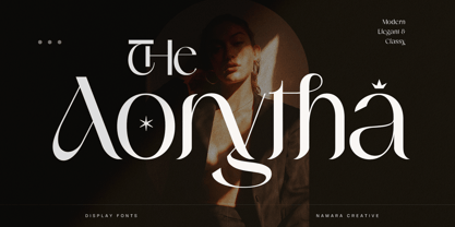 Modern display typeface with beautiful contrast. Decorative details on each character maintain its classy composure. Perfect for logo/branding identity, headline, wedding invitation, poster, and more, to create a project with a classy and luxury touch.
 - Advertisers Gothic by SoftMaker,
$8.99 With Advertisers Gothic, SoftMaker revives a 1917 design by Robert Wiebking. Inspired by Art Nouveau (Jugendstil) lettering, this typeface is as fresh as it was back then and is well-suited for advertising and display work.
 - Old Jersey Distressed by Alphabet Agency,
$15.00 Old Jersey Distressed is a cool, vintage styled and rough textured display font. This adaptable font will look great on a variety of design ideas. It will add a distinct touch to each of your projects.
 - Mentari by Surotype,
$35.00 Mentari a brush script typeface, bold and elegant, with several alternate characters in each letter to give you ease in accomplishing the work of typographic such as logotype, poster, headline, T-shirt and other creative projects.
 - Aotani by Rezastudio,
$9.00 Aotani is a thin lettered and simple sans serif font. Masterfully designed to become a true favorite, this font has the potential to bring each of your creative ideas to the highest level! Email : rezamukhtazar6@gmail.com
 - Stay Peach by Sans And Sons,
$19.00 Stay Peach is Modern Retro Serif with Unique Elegant and Retro Style. Each unique come with alternate letters designed to create harmoniously, charming and lend themselves to high end branding, product packaging, logo designs & invitation designs.
 - PIXymbols Signet Classic by Page Studio Graphics,
$29.00A font package to generate traditional three-letter monogram designs, or a single initial. Includes 29 borders, each accessed by a single keystroke on the computer keyboard. The borders will automatically line up with the initials. - Rocktopus by Okaycat,
$24.50 Rocktopus is a minimal fat blocky letter font. Each letter is designed for simplicity and maximum style points. Check it out! Rocktopus is extended, containing West European diacritics & ligatures, making it suitable for multilingual environments & publications.
 - Pink Mouse by BA Graphics,
$45.00 A 60s, 70s revival this curled casual latin brings back that great look. The font comes with an alternate version which can be used as a separate font or you can mix and match the two.
 - Head Strung by PizzaDude.dk,
$17.00 The Head Strung font is designed with a simple and basic serif structure, but has its oddities and curly lines. It comes with 4 different versions of each letter, and these automatically cycle as you type.
 - Susanna by K-Type,
$20.00 A light sans serif designed for Susanna Lakner’s 22 Days mail art project. The characters were drawn on each of 22 evenings throughout November 2004. In December the drawings were scanned to create the Susanna font.
 - Rough Bluff by PizzaDude.dk,
$18.00 Rough Bluff is all about making a statement with rough and uneven strokes. I've added 7 different versions of each letter, and they automatically changes as you type - or you can choose your favourite ones manually.